Nano Banana 2.1 Biotech Poster Prompt: Three-Run Test
Three Nano Banana 2.1 biotech posters share a hydrogel style but vary in emblems and small text. See the exact prompt, settings and results.
Prompt Library · Static concept posters · Three-run test
By Yuki Yu · Prompt Library · Blog 172 · Updated November 6, 2026
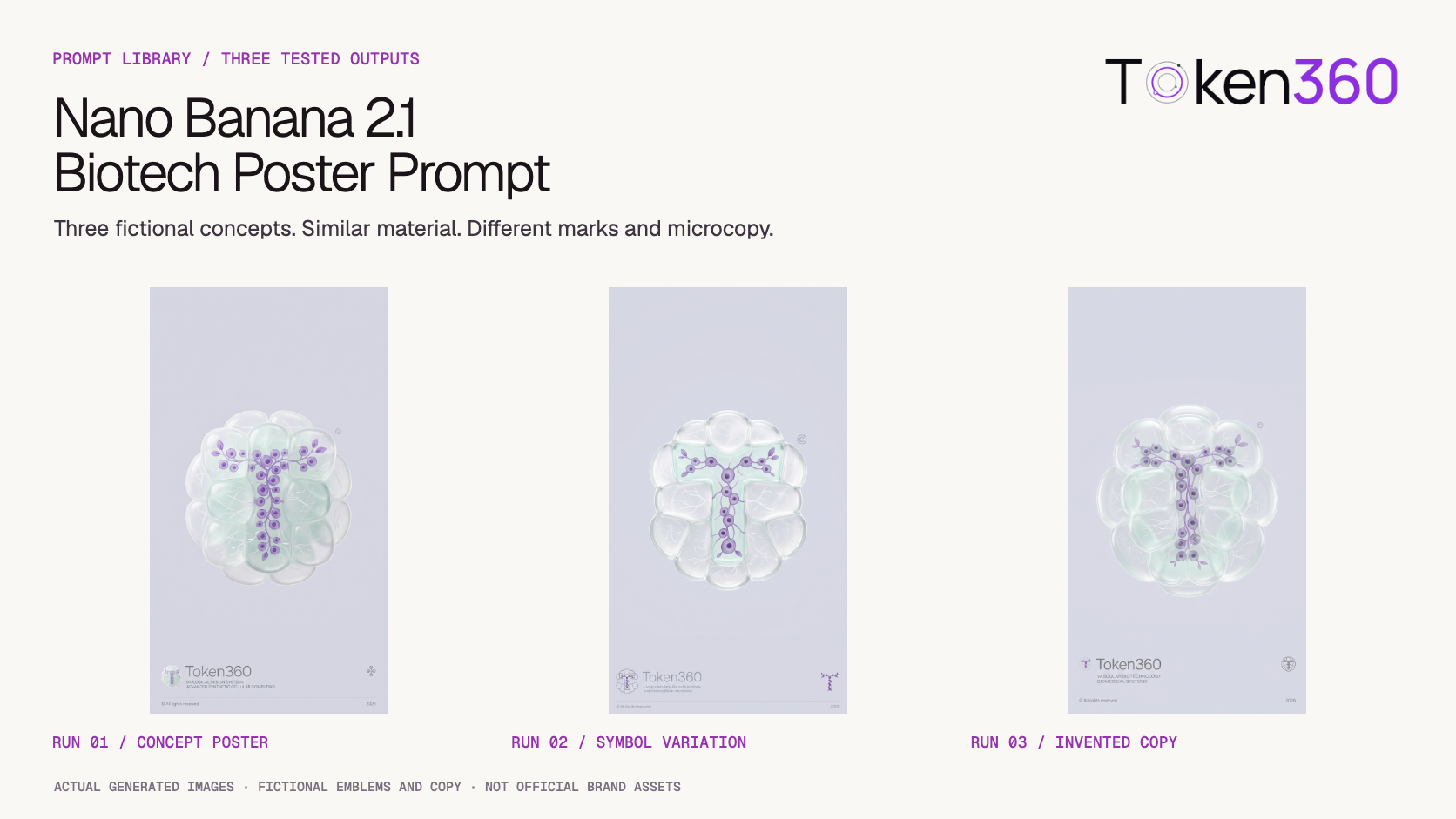
This biotech poster prompt produced a similar hydrogel aesthetic across three Nano Banana 2.1 generations. Each poster contains a readable purple T, translucent cellular forms and a minimal vertical layout. However, the smaller symbols do not consistently match the central emblem, the taglines contain malformed wording or unsupported business descriptions, and several strict visual constraints are only partly followed.
Test records reviewed: November 6, 2026. Three separate requests through the Token360 API; no reference image or official logo supplied.
Read first: Token360’s model capability guide explains how to check the current request contract before using an image prompt. This entry examines a specific poster test, not a model ranking.
The broad visual direction is similar across all three samples: pale lavender-grey backgrounds, milky translucent cells, purple branching structures and white filaments. Each contains a recognizable T and a lower-left Token360 wordmark. Exact emblem geometry, miniature symbol matching, typography and tagline content vary, so stylistic similarity should not be treated as a finished identity system.
Requirement
Observed in this test
Assessment
Readable first letter
A purple T is recognizable in all three.
Repeated in this sample.
Hydrogel material
Milky, mint-tinted transparent chambers and white fibers appear throughout.
The material direction is recognizable.
T-shaped outer silhouette
The inner T sits inside a largely oval cellular cluster.
The outer contour does not closely follow the letter skeleton.
Perfect symmetry
The overall forms are roughly balanced, but individual cells and branches differ.
Not exact.
Matching small emblems
The lower-right icons differ from the main hydrogel emblem.
Not exact reuse in this set.
Small type
Wordmarks are readable; taglines vary and include invented or malformed wording.
Requires copy review and replacement.
No gradients or reflections
Visible background tonal variation and bright specular-looking highlights remain.
The flat-background requirement is not met; the highlights also conflict with a reflection-free visual reading.
These are visual observations from the three saved PNGs, not blinded scores or a measured model success rate. Symmetry was assessed by visible cell and branch differences, not a pixel-level symmetry metric. “Specular-looking” describes the rendered appearance; it is not a measurement of physical reflectance.
Run 1: an editorial pick with incorrect business copy
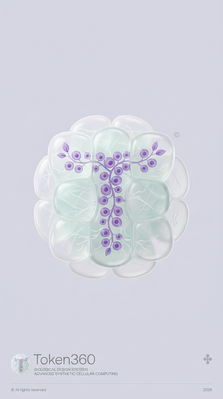
The first poster combines a clear T with a relatively complete bottom layout. Its lower-left small emblem resembles the main image, but the right-hand icon is a different diagram-like mark. The tagline introduces “BIOLOGICAL DESIGN SYSTEMS” and “ADVANCED SYNTHETIC CELLULAR COMPUTING,” neither of which was supplied as approved Token360 copy.
Run 1 — AI concept, not an official brand asset. Selected as the main example for its overall presentation, with the generated business claims explicitly rejected.
Run 2: clear letter, weak microcopy
The second poster retains the T, floating cell cluster and pale palette. The lower-left emblem becomes an outlined version, while the lower-right mark shows a purple T without the hydrogel enclosure. The microscopic tagline contains malformed wording rather than usable brand copy, demonstrating why decorative text still needs inspection.
Run 2 — the visual theme holds, but the three emblems are not faithful copies of one another.
Run 3: richer fibers, another invented business description
The third poster uses a larger rounded cluster with prominent branching white filaments. The purple T remains readable, but the bottom-right icon is an outlined variation, not an exact miniature. Its tagline, “VASCULAR BIOTECHNOLOGY / BIOMEDICAL SYSTEMS,” is an invented identity statement and must not be presented as Token360’s business positioning.
Run 3 — a similar material palette with different proportions, emblem details and copy.
What is the exact biotech poster prompt?
The tested prompt substitutes Token360 for the brand placeholder and purple for the color placeholder. No official logo, approved tagline or color hex value for purple was added. The internal letter is therefore a newly generated T-based concept, not a reconstruction of an existing brand mark. All three requests used this same text.
Copy the exact tested prompt above. To explore another concept, replace the brand name and the two purple color mentions. Other brands and colors were not tested here, so their results remain unverified.
Which model and parameters were used?
All three saved request bodies were identical. Each requested one image from nano-banana-2.1 at a 9:16 aspect ratio, with no seed, size or resolution field specified. The retained response summary reports gemini-nano-banana-2.1 and a 1k size label for all three runs. The downloaded PNG files measure 768 × 1376 pixels.
API
POST https://api.token360.ai/v1/images/generations
Requested model
nano-banana-2.1
Response model field
gemini-nano-banana-2.1 in all three runs
Count
n: 1, three separate requests
Aspect ratio requested
9:16
Size / resolution
Not explicitly set in the saved requests
Seed / reference image
Not set / none
Actual output
Three PNGs, each 768 × 1376; response label 1k
The actual file ratio is approximately 0.558:1, close to but not exactly 9:16. Matching response model fields do not reveal undisclosed backend version or routing details. Review the Token360 image generation API reference for the request format.
The submitted request records contain no API keys and can be inspected individually:
Where did emblem matching and poster copy diverge from the brief?
The prompt asks a single generation to invent an emblem and then reproduce it twice at a smaller scale, alongside a wordmark, microscopic tagline and footer. The results show approximate visual repetition rather than exact symbol copying. Text generation also remains open-ended because the two-line tagline is requested without specifying its actual wording.
That missing copy leaves room for the generated biotech claims. The tagline errors are therefore not all spelling failures: some text is readable but factually inappropriate for the brand. Token360’s confirmed positioning concerns enterprise access to text, image, audio and video models; the poster’s biomedical descriptions are not supported by the brand fact sheet.
There is also a design tension between glassy walls and softly glowing material on one hand, and “no reflections” on the other. Similarly, the demand for a T-following silhouette is not satisfied merely because an internal T appears. These are separate checks, and the results should be judged against both.
How can you adapt this prompt without mistaking it for a brand kit?
Treat the prompt as a concept-generation brief and decide which requirements matter before submitting it. Material exploration, exact emblem reuse and approved marketing copy are different acceptance checks. The following process helps organize a new attempt, but no revised prompt or finished design workflow was tested in this article.
Choose the concept subject. Replace the brand placeholder only with a name you are authorized to use. The present evidence covers Token360 and the letter T; another initial is a new test.
Separate style from brand assets. Decide whether you want an invented organic letterform or an exact supplied logo. The three saved requests had no reference image, so they do not test official-logo preservation.
Specify copy deliberately. Use approved text or remove the open-ended tagline instruction. That changes the tested prompt; save the revision separately instead of labeling it as the exact version shown here.
Record requested and delivered settings. Keep the model ID, aspect ratio, request body and original image. Inspect the actual file dimensions rather than assuming a requested ratio was delivered exactly.
Inspect each mark and line. Compare the central emblem, bottom-left miniature and bottom-right miniature individually. Check wordmark spelling, tagline meaning and footer text at full size.
Keep the concept label attached. Any downstream layout or copy replacement needs its own review. Selecting a good-looking sample does not validate its business statements.
For exact repeated symbols, placing copies of a single approved asset is a separate layout operation. It is not evidence that this generation prompt can reproduce the same geometry in multiple locations.
When is this prompt worth using?
This prompt is useful for exploring organic letterforms, translucent materials and a minimal biotech-inspired poster direction. It is less suitable for producing an approved brand identity in one step. The test supports a repeated aesthetic across three samples, not exact logo consistency, truthful marketing copy or reliable performance across other brand initials.
Choose the acceptance standard before selecting a sample. A material mood board can tolerate approximate miniature marks; an identity presentation needs approved symbols and accurate copy. The first use is supported by the visible concept direction here. The second would require additional production and review that this test did not perform.
The first poster is the strongest presentation candidate here, but none should be published as an official Token360 biotech announcement. Keep the concept label visible and replace invented business descriptions before adapting any result into brand communication.
Frequently asked questions
Is the hydrogel T Token360’s official logo?
No. No official logo was supplied to these requests. The T-shaped structures are generated concept emblems, and the poster wordmarks are generated text. Neither should replace approved brand assets.
Did all three posters follow the exact same layout?
They share the broad vertical composition, central hydrogel cluster and lower text area. Symbol proportions, miniature marks and microcopy differ. Similar layout direction is not pixel-identical or geometrically exact repetition.
Why did the model invent a biotech tagline?
The prompt asks for a two-line tagline without providing its wording. That leaves the copy unspecified. The outputs contain invented descriptions, but this test does not isolate a model-internal cause or prove that supplying exact text would fully solve the problem.
Can I reproduce the selected poster exactly?
These records do not establish exact reproducibility. No seed was supplied, and matching request bodies produced different images. The response model label also does not disclose every backend condition.
Where does the prompt come from, and what was tested?
The user supplied the prompt as “Organic Biotech Brand Poster,” attributed to Amir Mushich, with a showcase post and a separate full-prompt reply. Both links returned HTTP 403 during the November 6, 2026 source check. Full-prompt republication permission has not been independently confirmed; credit alone does not establish permission. Attribution is retained as supplied; source engagement figures, original post date and original model attribution are not presented as independently reverified facts.
This article covers three static text-to-image posters, with Token360 and purple as the only placeholder substitutions. It includes no reference-image matching, animation, alternate colors, alternate initials or cross-model comparison. All three generated images are shown without retouching.




 Guides
 Guides
 Guides